Configuring Content Items
Content Items, wrappers around Incentive Campaigns, Wallets or Content, can have different appearances. Two things determine how an Item looks:
- The Zone the Item is placed in. Its Layout Type and Orientation are configured in the "Content management" section of Console.
- The underlying Campaign. Text, images, colours and any click/tap action are configured in the "Promotional content" section of the Campaign Edit Form.
The first part of this page covers Zones and later sections cover campaign configuration for content management. For a step-by-step flow on editing campaigns, see Preview and edit promotional content in the Platform section.
- Layout Types
- Item Detail Page
- Editing a Content Item
- Item Actions
- Campaign Fields
- Text content guidelines
Layout Types
Content Items support a variety of Layout Types, which are defined by the Zone in which the Item is placed. This means every Item in a Zone will have the same Layout Type. Content Items are connected to Campaigns and every Campaign supports all Layout Types.
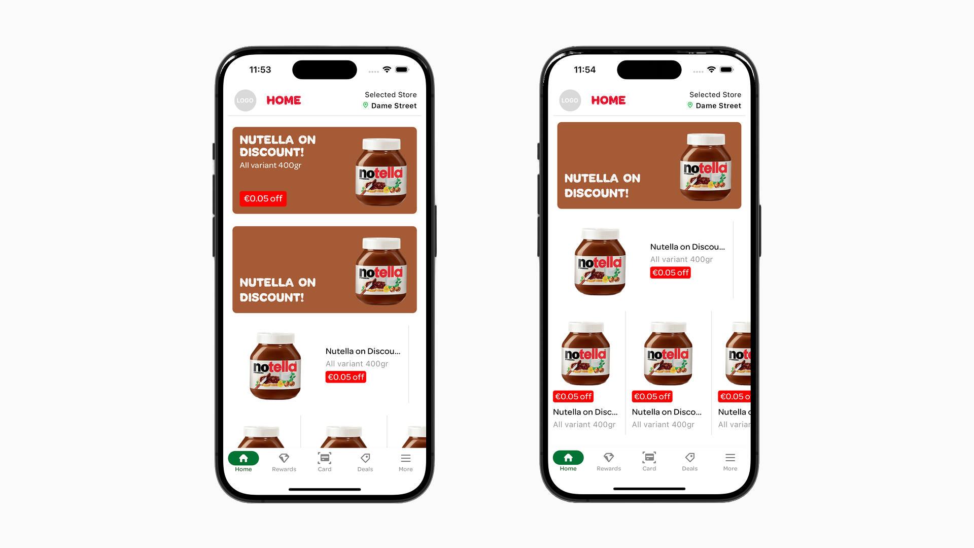
The screenshot below shows the different Layout Types for a single example Campaign.
Card: The Card Layout Type will always display all elements for the specific certain Campaign Type. In the first screenshot below, the top Item is in the card layout.
Card Small: A compact, horizontal row-based layout. A small image is displayed on the left, with the title and description in the center and an action badge on the right.
Banner: With the Banner Layout Type, only the title is displayed on the bottom left with a background image (if present). This is visible in the second Item in the first screenshot image below.
Tile Detailed: An image on the left with title and description on the right. This is great for more product-related content. Depending on the Campaign additional elements may also be shown. This Layout Type is visible in the third Item in the first screenshot image below.
Tile: An image above with title and description below and also great for more product-related content. There is not much Vertical space so only limited additional elements will be visible, depending on the Campaign Type. This is visible in the last Items on the second image below.
Layout Types examples:
Orientations
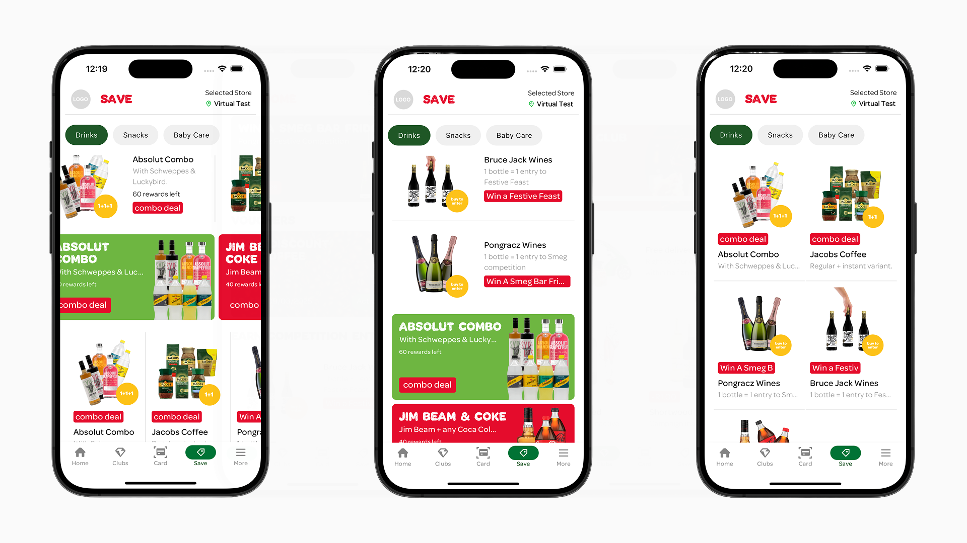
Together with the Layout Type the Orientation will help you create a great user experience when it comes to displaying your content. Usually Horizontal will put all Items in a slider and Vertical will put them in a list. When the Layout Type is Tile and the Orientation is Vertical the Tiles will display in a grid.
Orientation Type examples:
Item Detail Page
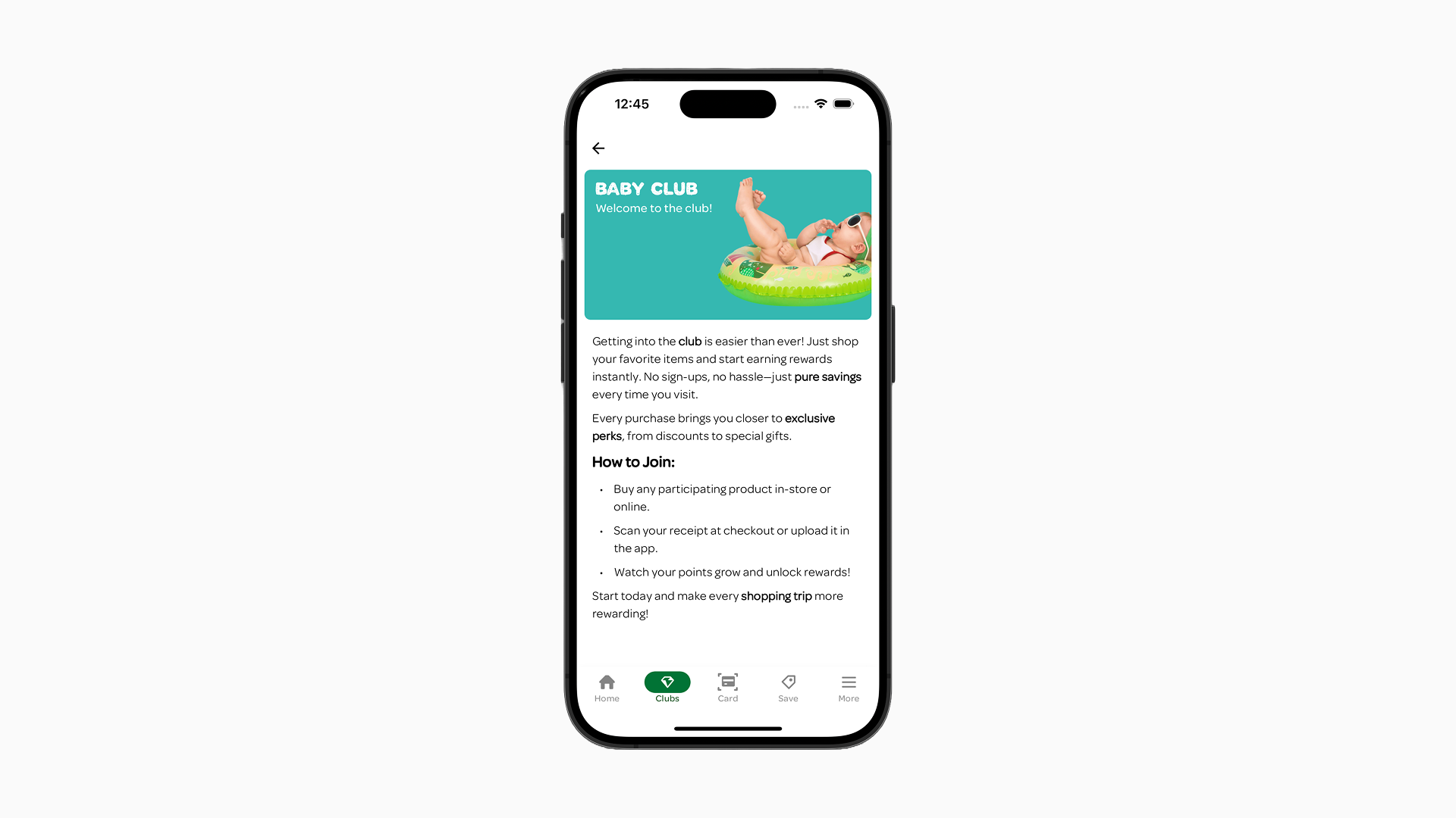
You can configure what happens when an Item is clicked or tapped, see Item actions. The default action opens the Detail Page. What the Detail Page shows depends on the Campaign Type of the Item:
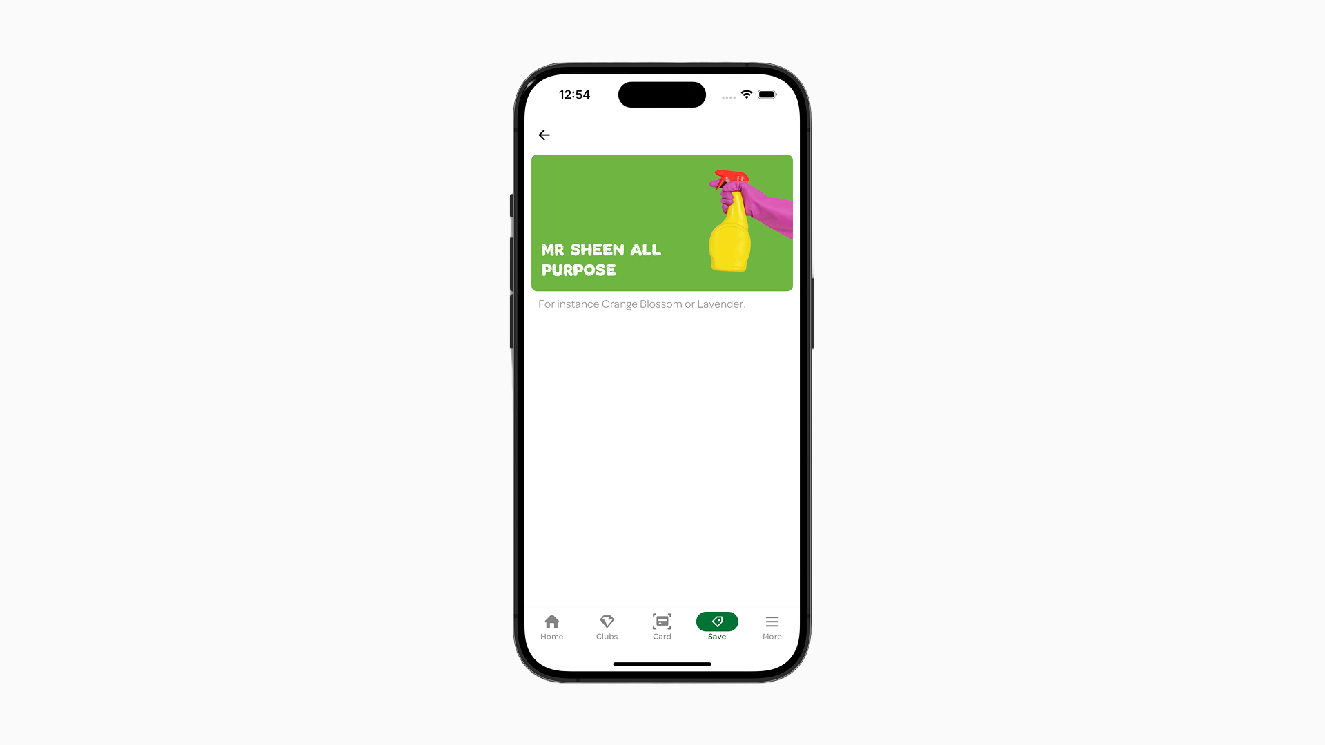
- Default: By default, the Detail Page of any Campaign Type displays the Campaign's Card layout at the top, followed by additional text below. This text is sourced from the "Detail page text" field from a Campaign. And for Vouchers by the "Voucher detail page text" field on the Campaign.
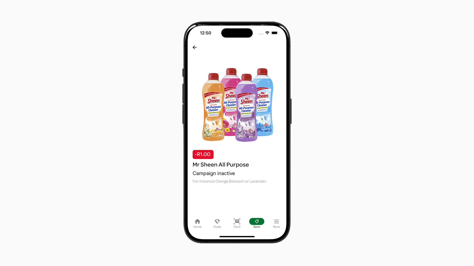
- Campaign Type "Personal Pricing Discounts": Campaigns of the "Personal Pricing Discounts" type are displayed in a large Tile layout. They include an image, title, and description, followed by additional elements and content from the "Detail page text" field. To create the discount label enter text in the "Label" field of the Campaign Form.
- Banner Layout Type: The Detail Page will have the Banner Layout Type and the top and the content from the "Detail page text" field below it.
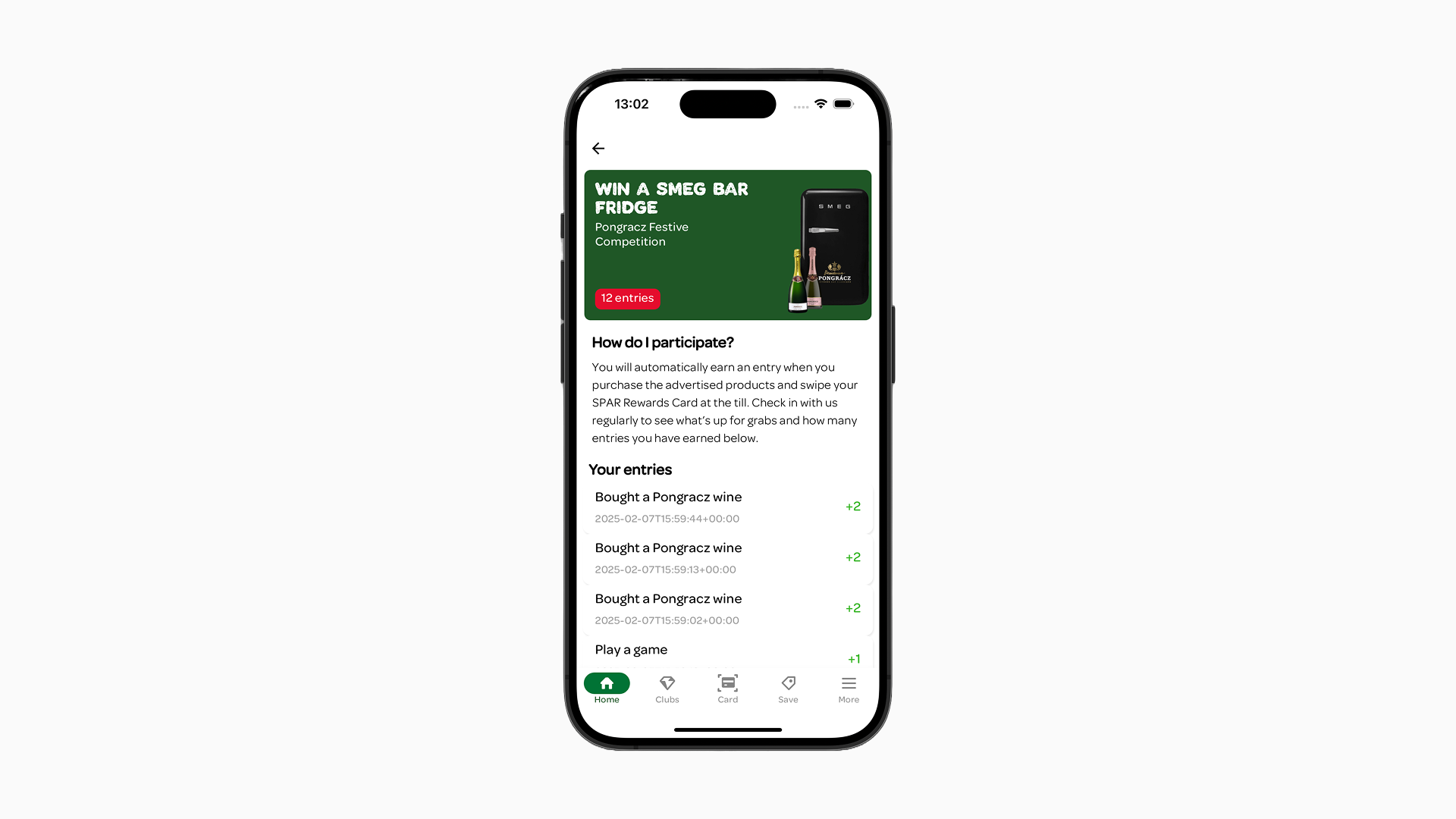
- Wallet Campaigns (points/monetary/competitions): Wallet Campaigns will have the Campaign displayed as a Card Layout Type on top, then below the content of the "Detail page text" field and below that information about the history of the Wallet balance for that customer.
Editing a Content Item
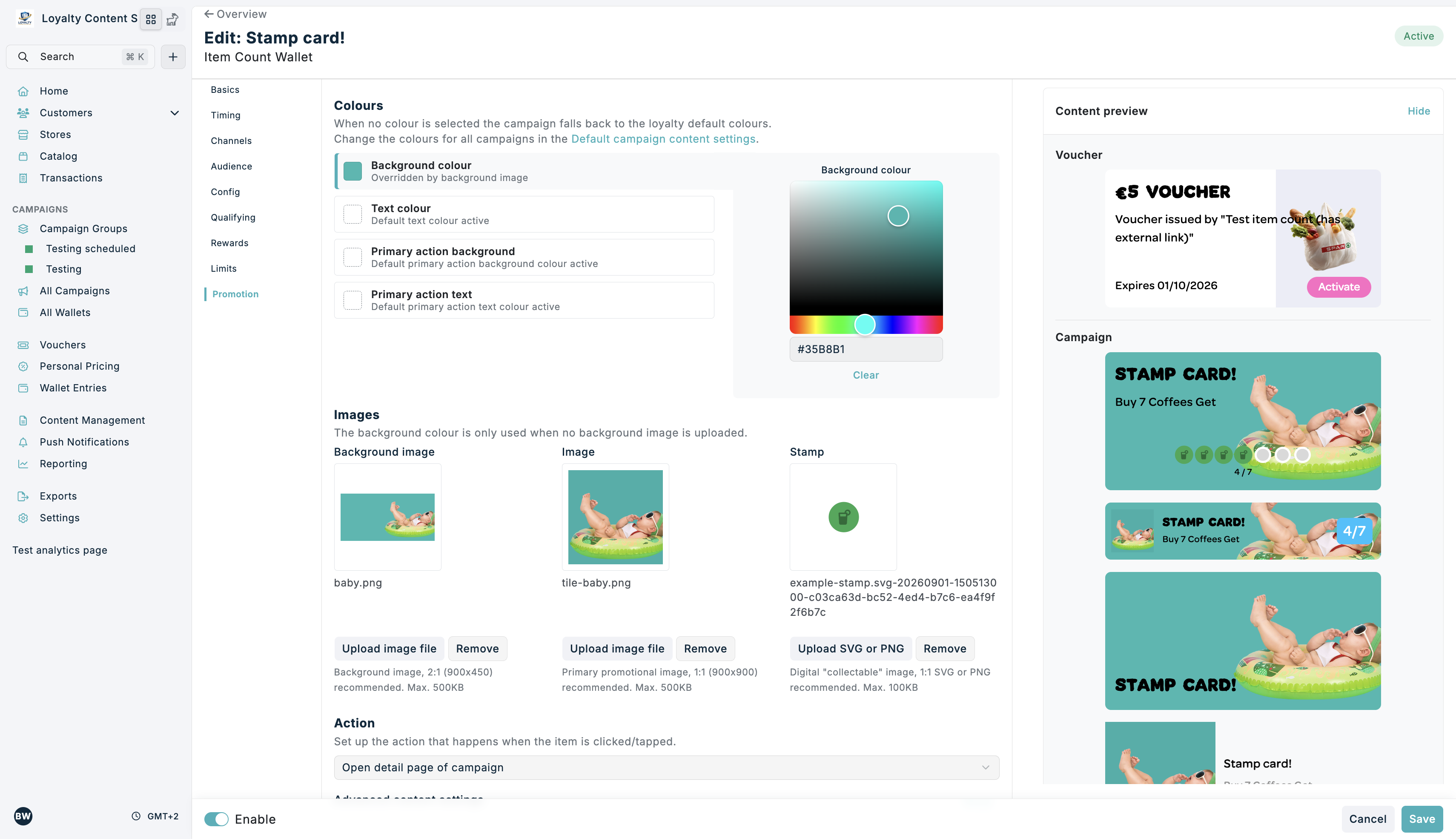
A Content Item's title, description, images and colours come from the underlying Campaign, which can be edited in the "Promotional content" section of the Campaign Form. This is split into two sections: styling settings for the Campaign and voucher styling settings (when the Campaign issues a Voucher).
The Promotional content section:
Content preview
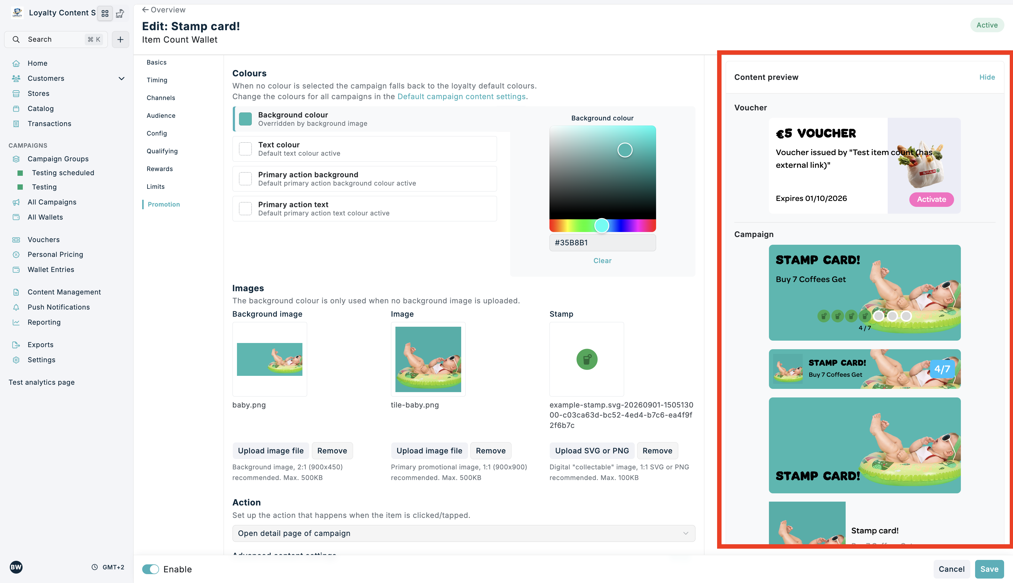
While you edit, a live "Content preview" shows the Content Item in the available Layout Types and, when the Campaign issues a Voucher, the Voucher Card. The preview updates as you type and matches how the Item will be displayed to customers.
On larger screens the preview is shown in a "Content preview" card in the sidebar. On smaller screens the preview is pinned below the form header while you scroll through the section.
Content preview beside the Promotional content section:
Colours and inherited values
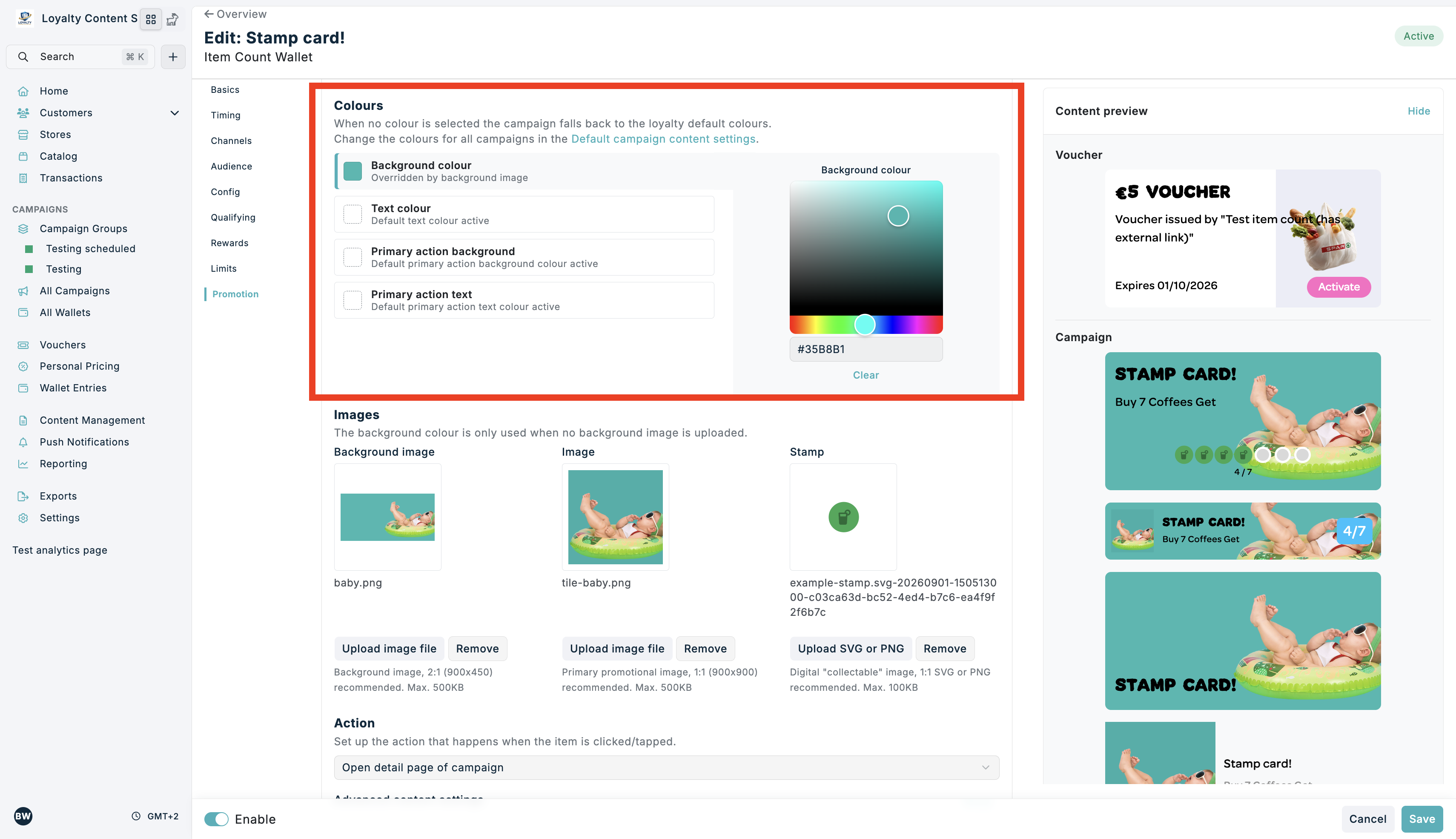
The colours of a Content Item are edited through a list of colour roles with one shared colour picker. Select a role in the list to change its colour.
When a colour is not set, the Item falls back to the loyalty default colours and the field shows a caption such as "Default background colour active". When a background image is uploaded, the background colour is not used and the field shows "Overridden by background image".
Colour roles with the shared colour picker:
Item actions
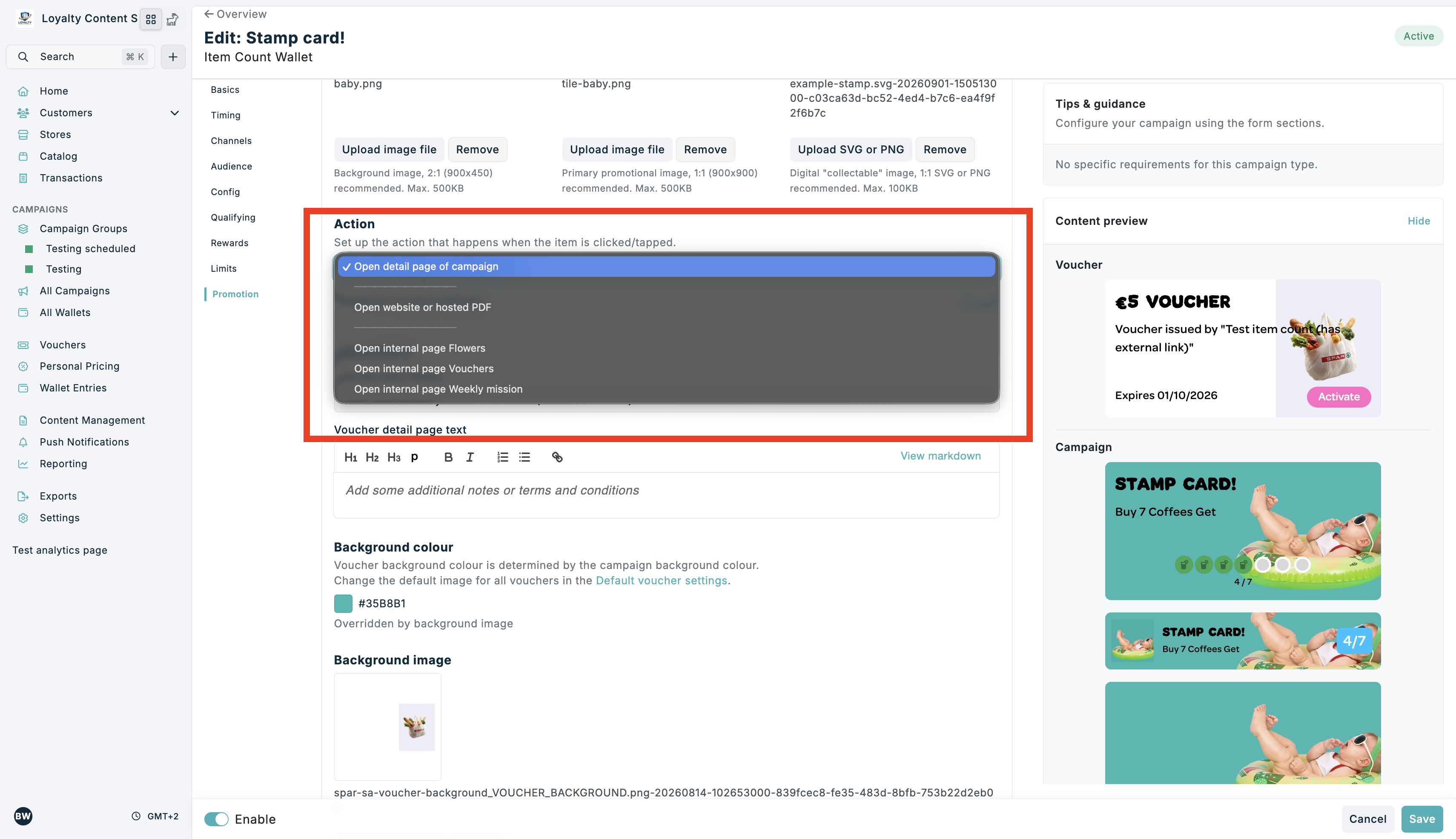
Each Item within a Zone can express a navigation intent. This is configured under the "Action" heading in the "Promotional content" section of the Campaign Edit Form in Spaaza Console. The action is selected from a dropdown. The following intents can be configured:
The Action editor:
Action: opening the Detail Page
The Detail Page shows the Item's Card Layout Type on top, with additional information below it. This information comes from the "Detail page text" field in the Campaign Edit Form.
Mobile App
Embed Elements
Your website decides whether a detail page opens. Your developers can find the details in the Embed Elements developer documentation.
Action: opening External Website / Hosted PDF
You can configure an Item to point to an external website or a hosted PDF (for instance, an advertising brochure).
In the "Promotional content" section of the Campaign Form:
- Under "Action", select "Open website or hosted PDF" from the dropdown.
- Enter the URL:
https://example.com - Save your Campaign.
How the external link opens depends on the channel:
Mobile App
Embed Elements
Your website decides how the link opens. Your developers can find the details in the Embed Elements developer documentation.
Action: Navigate to internal page (grouping content)
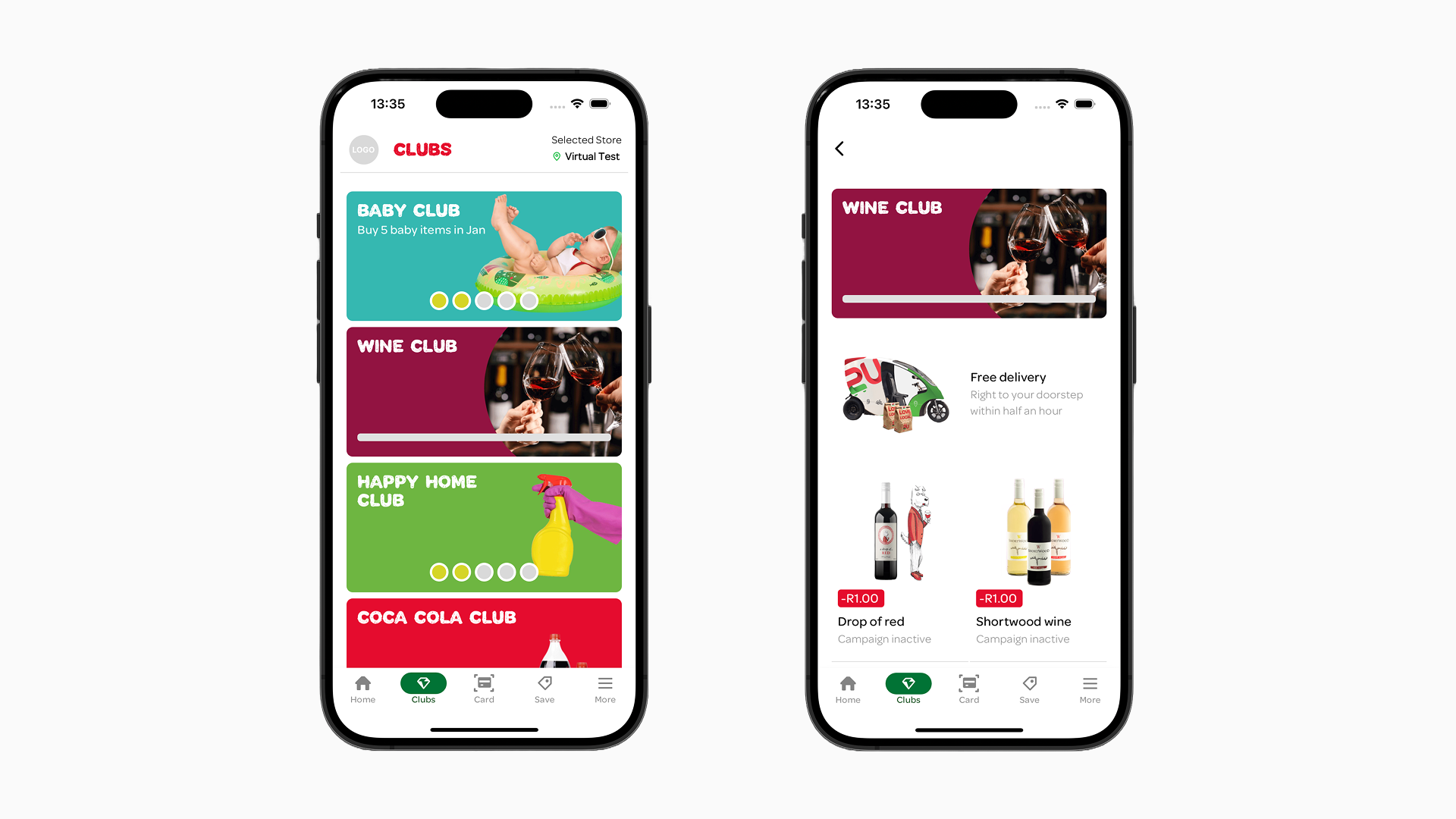
You can configure an Item to point to any page you have configured in the content management system.
In the "Promotional content" section of the Campaign Form:
- Under "Action", select "Open internal page ..." from the dropdown. All pages configured in the content management system are listed automatically.
- Save your Campaign.
Embed Elements
The dropdown also offers "Create custom schema (advanced)". Only use this when your developers ask for a specific value. They can find the details in the Embed Elements developer documentation.
Action: navigate to internal Page:
Campaign fields
The following Campaign fields are relevant for configuring content Zones & Items and will affect if and how they are displayed. Unless stated otherwise, the fields live in the "Promotional content" section of the Campaign Edit Form.
- Title: This will be displayed as the title of the Item. The maximum number of lines supported can vary depending on Campaign and Layout Type.
- Enable campaign: Only active campaigns will be visible to end users. In the content management system campaigns that are NOT "active" are visible.
- Description: A single line of text. The maximum number of lines supported can vary depending on Campaign and Layout Type.
- Label: Used for campaigns that support the display of a discount label; can be used for campaigns in the campaign type group of "Personal Pricing Discounts*". Keep this line as short as possible for instance: "£1,- discount".
- Detail page text: Provide additional information about the Campaign, focusing on more long-form content. This is displayed on an Item's Detail Page.
You can style this content by using the editor (or you can add "markdown" to it yourself). You can also add inline text links to external websites or hosted pdf's. - Audience: Campaigns can be targeted to a user segment. Only users within the segment will see the Campaign. When a segment is selected, the option "Promote this campaign to customers outside this segment" becomes available. Enabling this will make the Campaign visible to all users, but the effect of the incentive will be de-activated for users outside the target segment.
- Voucher title: Entered in the "Rewards" section. This is the title of the Voucher that is issued by the Campaign. The maximum number of lines supported can vary depending on Campaign and Layout Type. Depending on the voucher type, the value may be automatically prepended to this title. See the "Incentive issued" field below.
- Voucher description: Under "Vouchers" in "Promotional content". This is the description of the Voucher that is issued by the Campaign. The maximum number of lines supported can vary depending on Campaign and Layout Type.
- Voucher detail page text: Under "Vouchers" in "Promotional content". Provide additional information about the Voucher, focusing on more long-form content. This is displayed on the Voucher's Detail Page. Similar field to the "Detail page text" field for the Campaign.
You can style this content by using the editor (or you can add "markdown" to it yourself). You can also add inline text links to external websites or hosted pdf's. - Incentive issued: For "Basket Voucher" type vouchers, the value and its symbol will be automatically prepended to the Voucher title (e.g. "€5" becomes "€5 fruits discount"), so do not type the value into the title yourself. For "Percentage" type vouchers nothing is prepended automatically. You would include the full label yourself (e.g. "50% discount" or "Free").
- Image: Displayed as main image for the Type Tile, Tile Detailed. For Card Small it is used as the image to the left of the card. It is also displayed on the Detail Page "Personal Pricing Discounts" Campaign Type. This image needs to be 1:1 ratio.
- Background image: Used as the background image for Card or Banner Layout Type Items. Also used as a fallback image for Card Small Layout Type Items when no Image is set. This image needs to be of 2:1 ratio. When a background image is uploaded, the Background colour is not used and the colour list shows "Overridden by background image".
- Stamp: For stamp card campaigns, the image used as the digital "collectable" stamp. A 1:1 SVG or PNG is recommended.
- Voucher background image: The "Background image" under "Vouchers" in "Promotional content". Used as the background image for the Voucher of the specific Campaign. When no image is set, the form shows "Default background image active" and the project-level default voucher image is used. For this, read the Styling Configuration section on the Managing Content page.
- Days to expiry: Days before a Voucher expires, visible as expiration date on a Voucher Card.
- Claimed: Determines if Vouchers are activated automatically upon creation or require manual activation by the user through a button. Leaving it unclaimed allows the user the flexibility to decide on what purchase they want to use the Voucher.
- No limit on the number of incentives issued per person: A message will be displayed on any type of Campaign indicating the amount of times the issued rewards can be redeemed.
- Colours: In this section you can change styling parameters for the Campaign Items. Click a colour role in the list, then pick a colour in the shared picker; click "Clear" to fall back to the default. When no colour is set, the campaign falls back to the loyalty default colours (the form shows a "Default ... colour active" caption); see Styling Configuration. The Voucher background colour is determined by the campaign Background colour.
- Background colour: This is the colour that will be used as the background for any "Card" or "Card Small" Layout Type Item if no image and/or background image has been set in the Campaign/Voucher edit form.
- Text colour: when set, this will change the text colour of title and description that appears on "Card", "Card Small", and "Banner" Layout Type Items.
- Primary action background: This is the colour of the button or the label that some Content Items have (depending on the Campaign Type).
- Primary action text: when set, this will change the text colour of the button or the labels.
- Assigned stores: Determines which stores the Campaign will run in. Campaign Items in Zones will only be displayed to a user if the user has selected a store that is assigned to the Campaign. If no specific stores are assigned, the Campaign will be visible to users regardless of their selected store.
- Action: Sets up the action that happens when a user clicks/taps an Item. For more information visit the Item actions section.
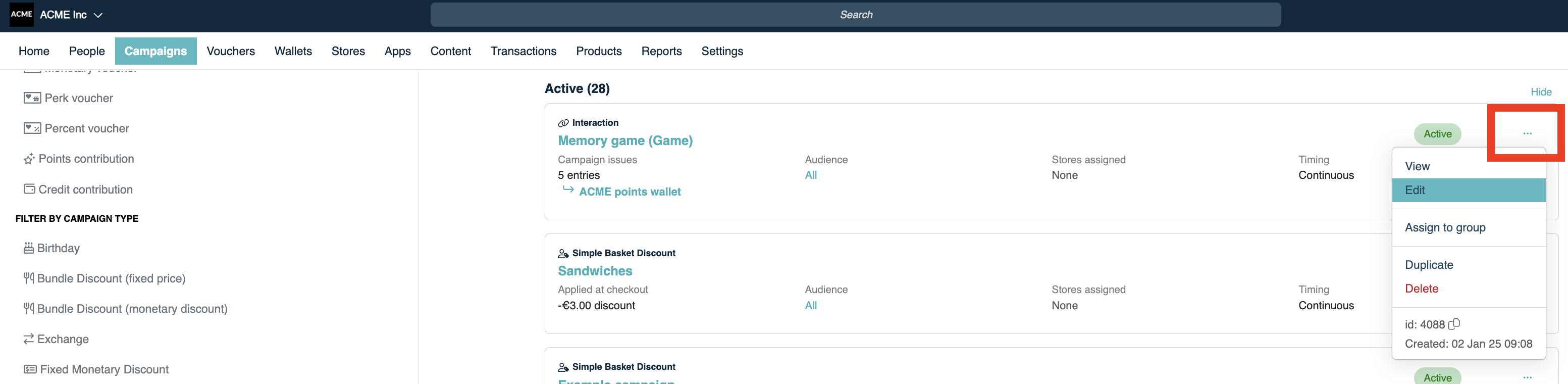
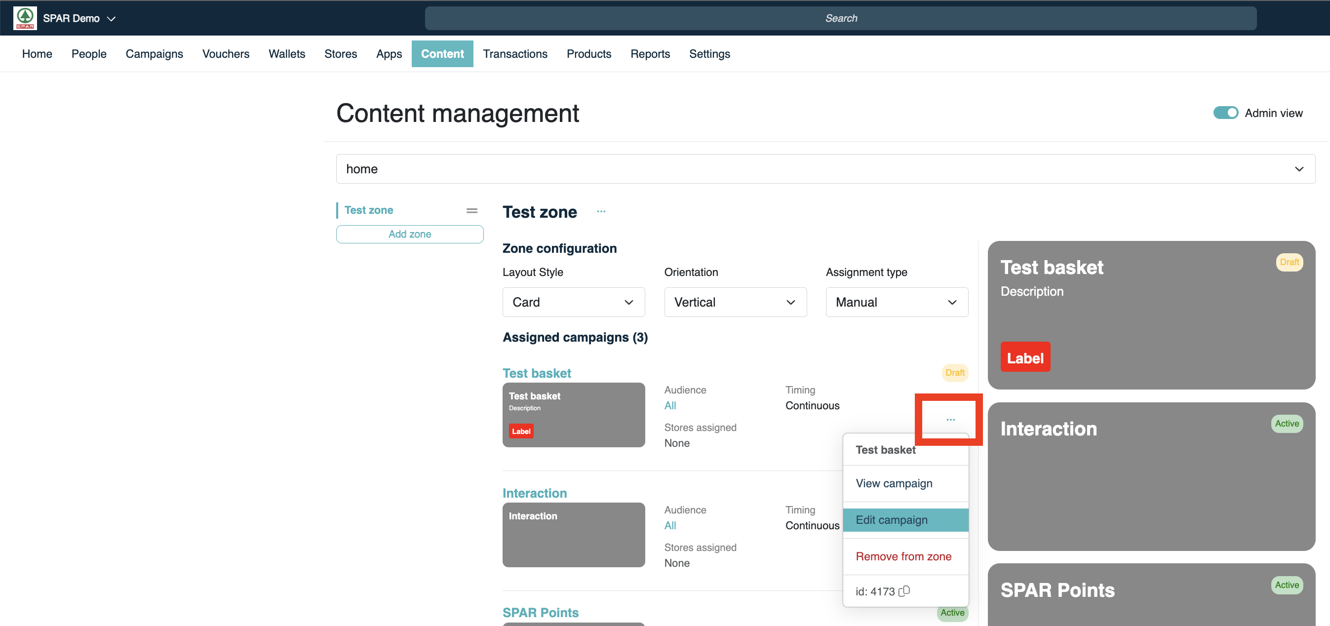
You can edit a specific Campaign through the "Campaigns" tab in Console by clicking the three dots ("...") and selecting "Edit" from the dropdown. You can also access the Campaign edit form through the Campaign content screen in the "Content" tab. Click the three dots ("...") and click "Edit Campaign".
Accessing Campaign from Campaign overview:
Accessing Campaign from content management overview:
Text content guidelines
Specific combinations of Layout Types, Campaign Types, and orientations of Zones create different limitation based on the amount of space available for text content.
Some texts will scale up until a certain point when you put a lot of text content.
When the text content is not within those limits the text will be truncated (the "..." dots yous see).
The general rule is to use as few words as possible for titles, descriptions, and subtitles (labels). For the best validation, try out the campaign you are running in the staging Spaaza Console environment.