Pages, Zones and Items
Pages, Zones and Items are the building blocks of Spaaza’s app solution. This page will help you understand the basic concepts behind how these building blocks work and how to use them.
Pages
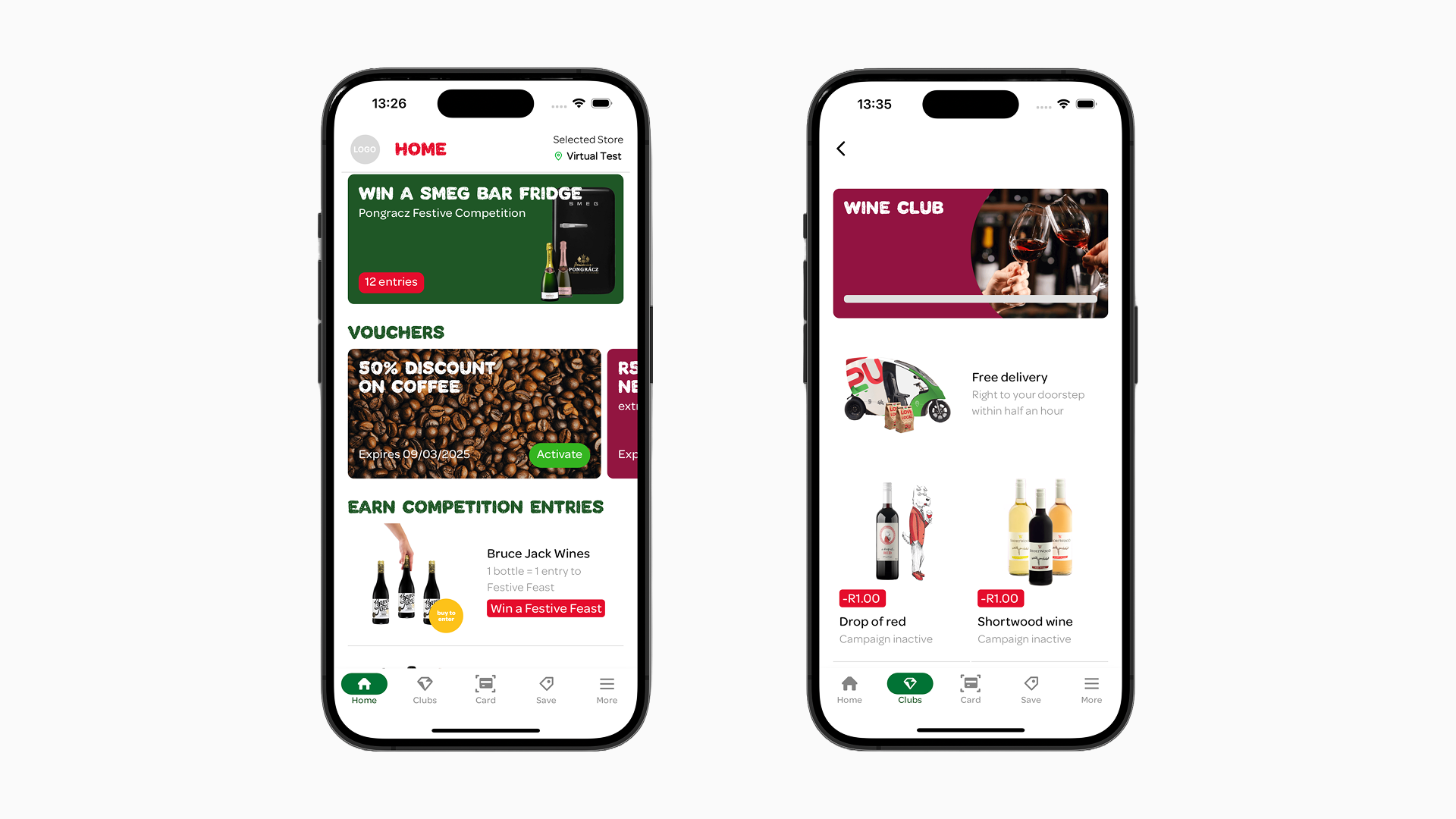
Pages serve as the framework for organizing and displaying content. The app’s default Pages are accessible through the main navigation menu: Home, Rewards, and Deals; however, you can also create your own custom Page. You are able to create, edit or delete an Pages.
Pages can be accessed by the user through the main navigation menu, navigation tabs (created at the top of pages) and by “tapping” on an Item to open its detail page. You can read more about this in the sections Managing Pages, Deals Page, and Item Actions.
Spaaza can adjust the names of the default Pages during the initial setup process of the mobile app.
Zones
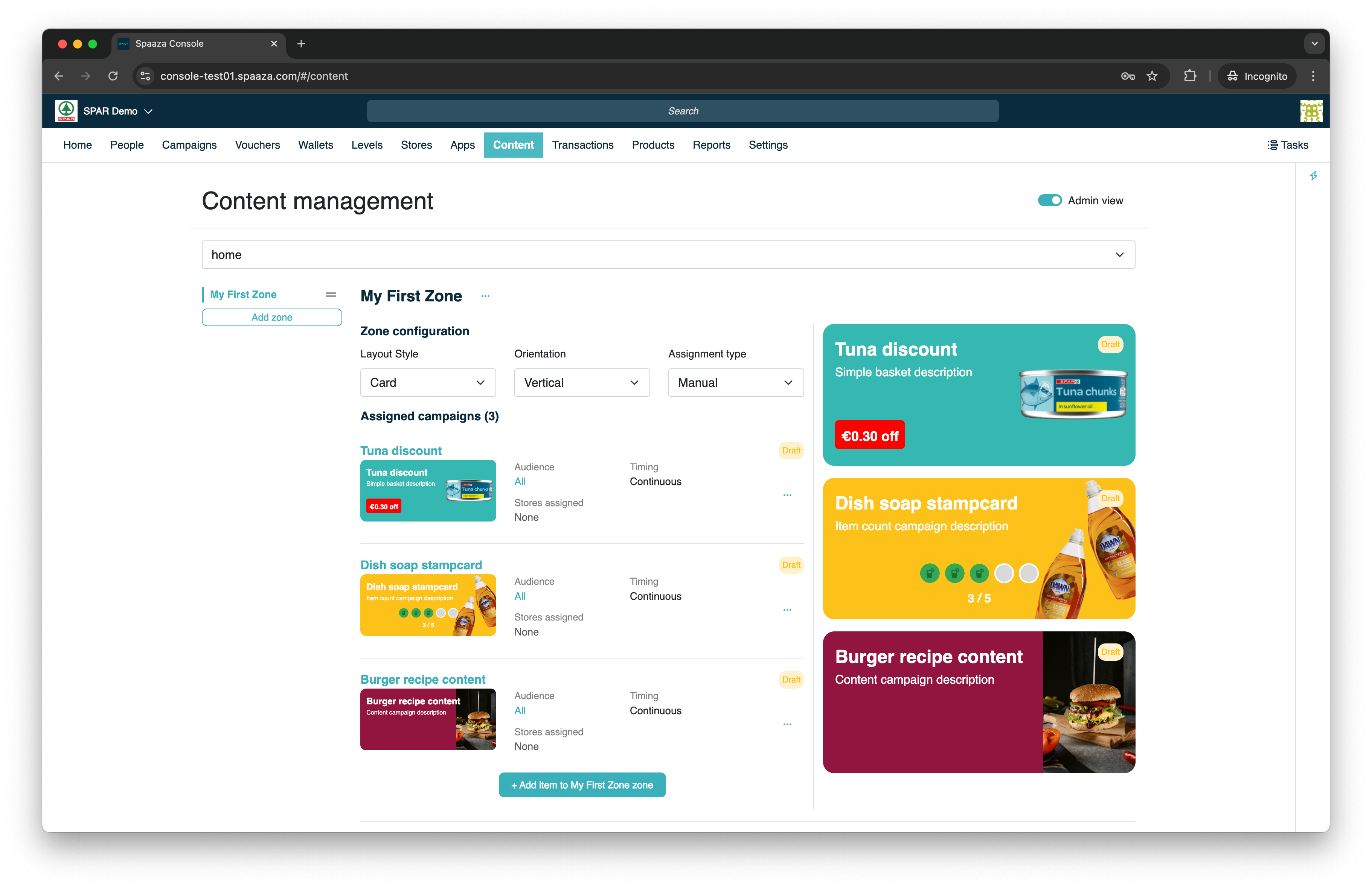
Zones are sections within a page, acting as containers for Items. Each Zone can be customized to determine how its Items are displayed. Pages can include multiple Zones, which can be added, removed, named, and re-ordered as you see fit.
Each Zone has four configurable parameters:
- Name: Assign a name to the Zone. You can also leave the name field empty!
- Layout Type: Defines how Items within the Zone are displayed. Options are: Card, Banner, Tile, or Tile Detailed.
- Orientation Type: Determines the arrangement of Items within the Zone. Options are Vertical or Horizontal. Combined with the Layout Type, this defines whether Items are shown in a list, slider, or grid.
-
Assignment Type: Specifies how content is added to the Zone. Choose between manually adding content or automatically populating it using selected filters.
- Manual: Select Campaigns manually from the Campaign overview list.
- Filtered: Automatically add Campaigns based on available Campaign filter tags and types.
You can reorder Zones on a page by dragging and dropping them in the page layout preview.
Management of Pages, Zones and Items:

Items
Zones are populated with Content Items. You can see these items as a wrapper around a Campaign that is setup in Spaaza Console. There are three types of Campaigns that can be created as Content Item. All of these type of Content can be added through Campaign Groups, starting from “All Campaign Groups” in the main menu.
- Incentive Campaign Items: These are Campaigns that issue rewards or give discounts. button. There is a large variety of campaign option. Please consort with Spaaza what will fit your needs best.
- Wallet Campaign Items: Wallets are a flexible store of value for customers and are used to store points, competition entries, donations, and more.
- Content Campaign Items: These display additional information—such as recipes or announcements—but do not have an inherent effect like wallets or campaign codes do.
You can add Content Items to a Zone or remove existing ones. All Items support the same visual appearance options, although the appearance of Content Items may differ for different Campaign Types. For example, a stamp card or Wallet Campaign will show slots to indicate how many stamps you have collected where a Member Pricing Type Campaign can be configured with a discount label.
You can reorder Items within Zones by dragging and dropping them in the Zone content preview.