Configuring Content Items
Content Items, wrappers around Incentive Campaigns, Wallets or Content can have have a different appearances. The Zone configuration has an effect on this and also the input on the actual Campaign Form has an effect.
Layout Types
Content Items support a variety of Layout Types, which are defined by the Zone in which the Item is placed. This means every Item in a Zone will have the same Layout Type. Content Items are connected to Campaigns and every Campaign supports all Layout Types.
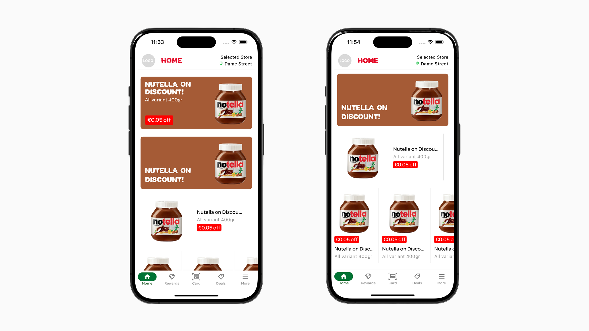
The screenshot below shows the different Layout Types for a single example Campaign.
Card: The Card Layout Type will always display all elements for the specific certain Campaign Type. In the first screenshot below, the top Item is in the card layout.
Banner: With the Banner Layout Type, only the title is displayed on the bottom left with a background image (if present). This is visible in the second Item in the first screenshot image below.
Tile Detailed: An image on the left with title and description on the right. This is great for more product-related content. Depending on the Campaign additional elements may also be shown. This Layout Type is visible in the third Item in the first screenshot image below.
Tile: An image above with title and description below and also great for more product-related content. There is not much Vertical space so only limited additional elements will be visible, depending on the Campaign Type. This is visible in the last Items on the second image below.
Layout Types examples:
Orientations
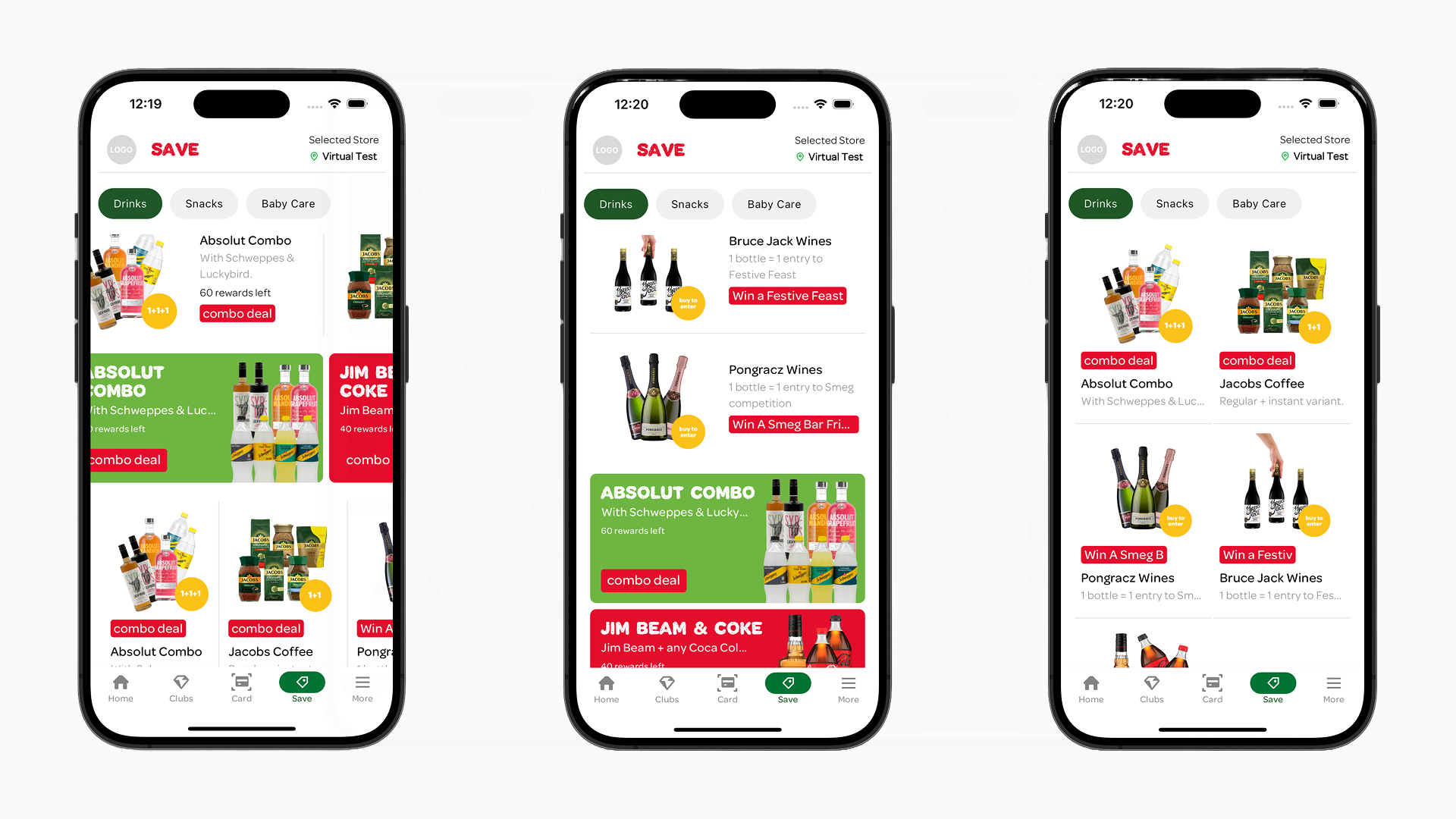
Together with the Layout Type the Orientation will help you create a great user experience when it comes to displaying your content. Usually Horizontal will put all Items in a slider and Vertical will put them in a list. When the Layout Type is Tile and the Orientation is Vertical the Tiles will display in a grid.
Orientation Type examples:
Item Detail Page
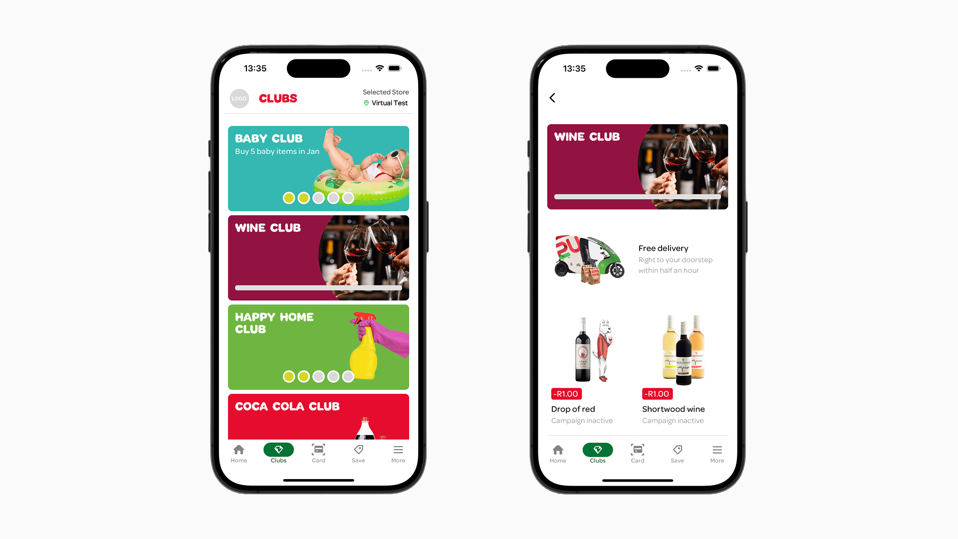
When you “tap” on an Item the default action is that you will be shown the Detail Page. The Detail Page can differ depending on the Campaign Type:
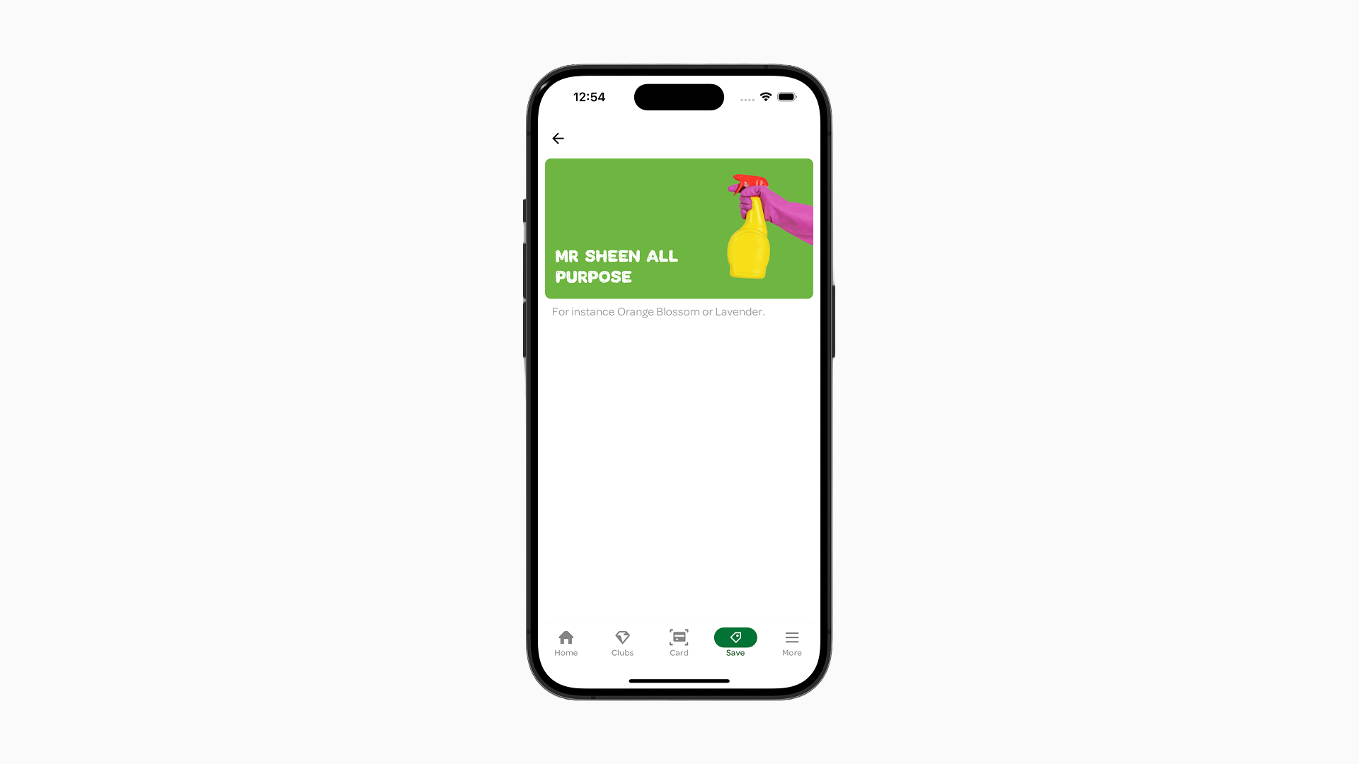
- Default: By default, the Detail Page of any Campaign Type displays the Campaign’s Card layout at the top, followed by additional text below. This text is sourced from the “Details” field from a Campaign. And for Vouchers by the “Voucher notes” field on the Campaign.
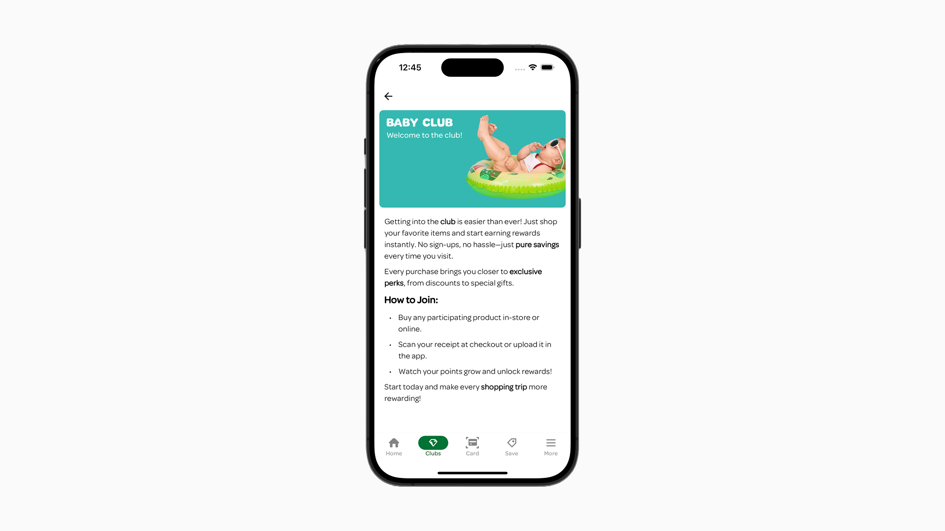
- Campaign Type “Personal Pricing Discounts”: Campaigns of the “Personal Pricing Discounts” type are displayed in a large Tile layout. They include an image, title, and description, followed by additional elements and content from the “Details” field. To create the discount label enter text in the “Label” field of the Campaign Form.
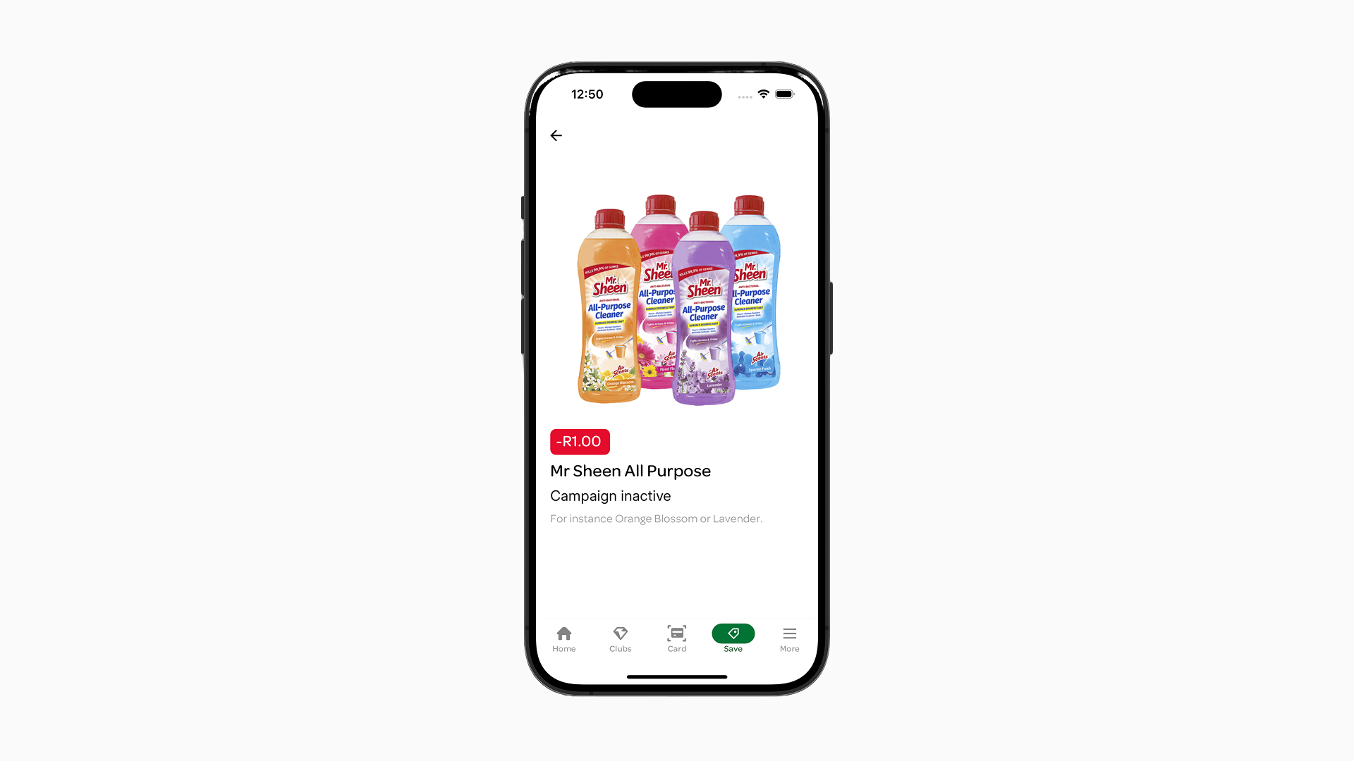
- Banner Layout Type: The Detail Page will have the Banner Layout Type and the top and the content from the “Details” field below it.
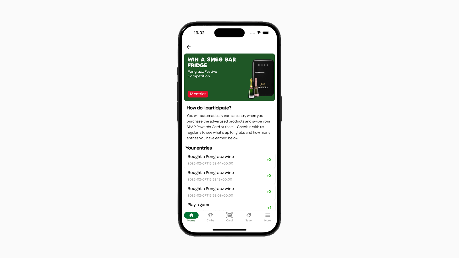
- Wallet Campaigns (points/monetary/competitions): Wallet Campaigns will have the Campaign displayed as a Card Layout Type on top, then below the content of the “Details” field and below that information about the history of the Wallet balance for that customer.
Item actions
Each Item within a Zone can have an action attached to it. By default, clicking on an Item opens it’s Detail Page but Items can also be configured to perform other actions, such as opening an external website in an embedded view within the app or displaying a hosted PDF file.
- Action: Opening the Detail Page (default)
- Action: Opening an external website / hosted PDF
- Action: Navigate to internal page (grouping content)
Action: opening the Detail Page (default)
The Item’s Card Layout Type will be displayed on top of the Detail Page, with space for additional information under it. This detailed information can be added or modified by updating the “Details” field in the Campaign Edit Form for the corresponding Campaign.
Action: opening External Website / Hosted PDF
The app can open any website inside of a view within the app. It also supports displaying PDFs that are hosted on websites, for instance, for advertising brochures. You will find more information about this at the. Campaign fields section.
If you want to set up this external resource links there currently slightly different based on the Item Type.
For Campaign-Type/Incentive-Type Items:
- In “Other promotional settings” you see the URL field, enter this url:
https://example.com - Save your Campaign.
- Test by tapping the Item inside the app. It will navigate to the resource you configured it to navigate to.
For Content-Type Items:
Set up in “Other promotional settings”, in the Campaign Form when editing a specific Campaign:
- Action: show web page
- URL:
https://example.com - Target: select “No action”
- Save your Campaign.
- Test by tapping the Item inside the app. It will navigate to the resource you configured it to navigate to.
Action: Navigate to internal page (grouping content)
You are able to configure that when a user “taps” on a Campaign/Content Item any page that is created can be opened. To create this type of link you need to configure the Campaign’s “Other promotional settings” in the Campaign Form.
The setup process differs depending on whether you’re working with Campaign-Type Items or Content-Type Items.
For Campaign-Type/Incentive-Type Items:
- In “Other promotional settings” you see the URL field, enter this exact url:
https://spaaza.com/browser?section=rewards&target=embeded&url=https://page-name.com - Replace
page-namewith your actual page ID. You can find the page ID of a page by clicking on the three dots (“…”) while you have your page selected. - Save your Campaign.
- Test by tapping the Item inside the app.
For Content-Type Items:
Set up in “Other promotional settings”, in the Campaign Form:
- Action: “show web page”
- URL:
https://page-name.com - Target: select “embed on app section”
- App select: select to rewards (independent from if you want it to show on the rewards screen!)
- Replace
page-namewith your actual page ID. You can find the page ID of a page by clicking on the three dots (“…”) while you have your page selected. - Save your Campaign.
- Test by tapping the Item inside the app.
Action: navigate to internal Page:
Campaign fields
The following Campaign fields are relevant for configuring content Zones & Items and will affect how they will display in the app:
- Title: This will be displayed as the title of the Item. The number of max lines supported can vary depending on Campaign and Layout Type.
- Enable campaing: Only active campaign will be visible in the app. In the content management system campaigns that are NOT “active” are visible.
- Description: Fills the description of the Item. The number of max lines supported can vary depending on Campaign and Layout Type.
- Subtitle (Label): Used for campaigns that support the display of a discount label; can be used for campaigns in the campaign type group of “Personal Pricing Discounts*”. Keep this line as short as possible for instance: “£1,- discount”.
- Details: Provide additional information about the Campaign, focusing on more long-form content. This is displayed on an Item’s Detail Page.
You can style this content by using the editor (or you can added “markdown” to it yourself). You can also add inline text links to external websites or hosted pdf’s. - Audience: As expected, campaigns will only be displayed for users that are not filtered out or are included as segment. There is one exception. When “Promote this campaign to customers outside this segment” is on, campaign will be displayed to users outside of the target segment. However, these campaign will be inactive. campaign that to a user segment
- Voucher title: This is the title of the Voucher that is issued by the Campaign. The number of max lines supported can vary depending on Campaign and Layout Type. Important note: when a voucher has type “Monetary” the voucher’s worth will be automatically put in in front of the title you enter (e.g. “£1,- discount”). For “Percentage” type vouchers this will not happen and the % will need to be put in the title field manually.
- Voucher description: This is the description of the Voucher that is issued by the Campaign. The number of max lines supported can vary depending on Campaign and Layout Type
- Voucher notes (Details): Provide additional information about the Campaign, focusing on more long-form content. This is displayed on an Item’s Detail Page. Similar field to the “Details” field for the Campaign. You can style this content by using the editor (or you can added “markdown” to it yourself). You can also add inline text links to external websites or hosted pdf’s.
- Incentive issued: When choosing a “Percentage Voucher” the value and its symbol will be prepended to the title of the Voucher. For a monetary example: “€5” will become “€5 off fruits discount.
- Image: Displayed when Layout Type Tile, Layout Type Tile Detailed are selected. It is also displayed on the Detail Page “Personal Pricing Discounts” Campaign Type.
- Background image: Used as the background image for Card or Banner Layout Type Items.
- Voucher image: Used as the background image for the Voucher of the specific Campaign. You can also configure a default voucher on project level.
- Days to expiry: Days before a Voucher expires, visible as expiration date on a Voucher Card.
- Claimed: Determines if Vouchers are activated automatically upon creation or require manual activation by the user through a button. Leaving it unclaimed allows the user the flexibility to decide on what purchase they want to use the Voucher.
- No limit on the number of incentives issued per person: A message will be displayed on any type of Campaign indicating the amount of times the issued rewards can be redeemed.
- Colors: In this section you can change styling parameter for the Campaign Items. Currently you are limited in using: Background Color and Primary Action Background Color. Any general styling configuration will be overridden by these more selective Campaign Styling Configurations.
- Background Color: This is the color that will be used as the background for any “Card” Layout Type Item if no image and/or background image has been set in the Campaign/Voucher edit form.
- Primary Action Background Color: This is the color of the button or the label that some Content Items have (depending on the Campaign Type).
- Text color: when set, this will change the text color of any content that appears on “Card” and “Banner” Layout Type Item’s. The colors are limited to either BLACK or WHITE. Any value entered will evaluate to either black or white dependant on the mix of brightness of the color chosen.
- Primary Action Text Color: when set, this will change the text color of the button or the labels.
- Assigned stores: Determines which stores the Campaign will run in. Campaign Items in Zones will only be displayed to a user if the user has selected a store that is assigned to the Campaign inside their app. If no specific stores are assigned, the Campaign will be visible to users regardless of their selected store in the app.
- Other promotional settings: These allow you to link tapping an item to navigate to a certain resource. This resource could be external, such as your company website or a brochure of current deals (PDF). For more information visit the Item actions section.
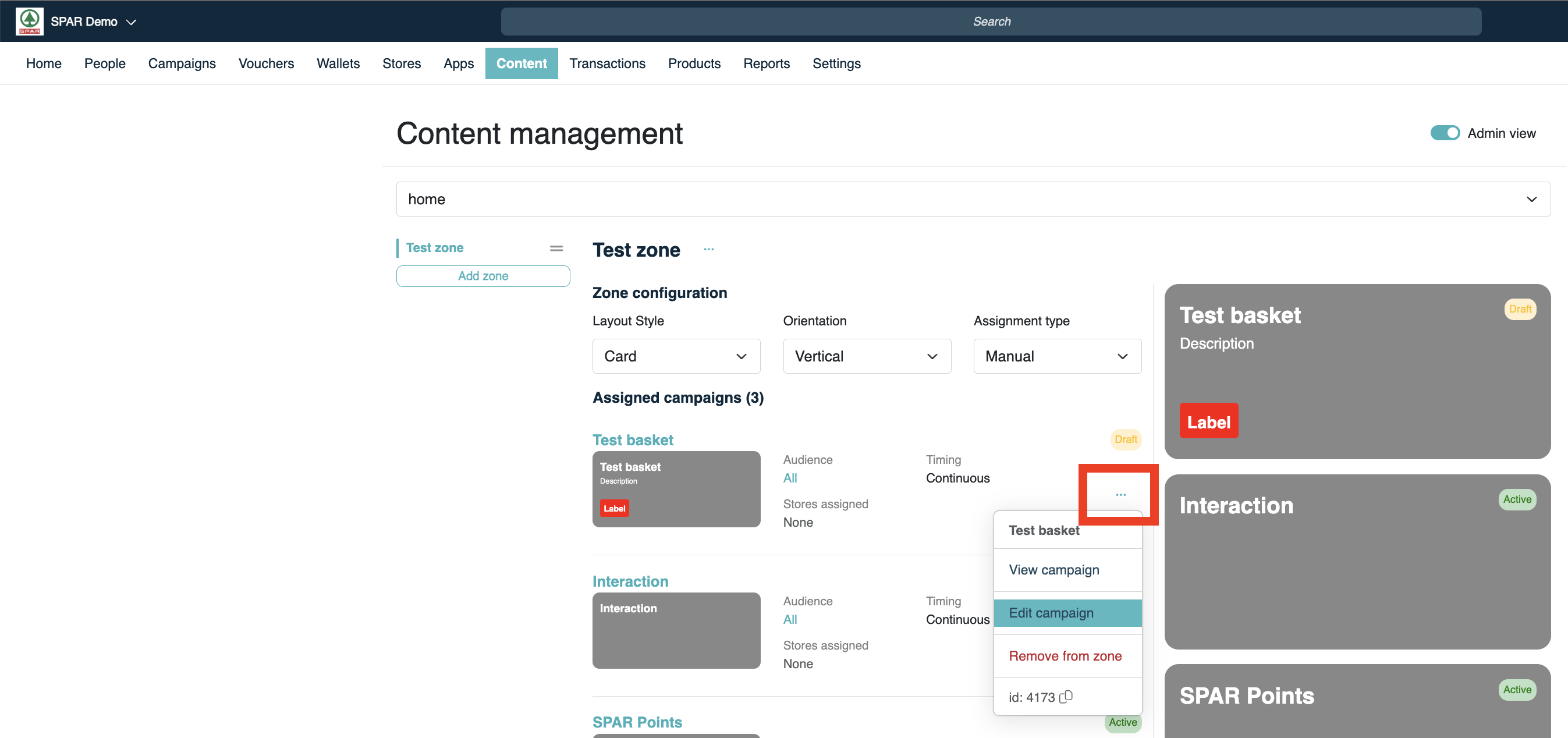
You can edit a specific Campaign through the “Campaigns” tab in Console by clicking the three dots (“…”) and selecting “Edit” from the dropdown. You can also access the Campaign edit form through the Campaign content screen in the “Content” tab. Click the three dots (“…”) and click “Edit Campaign”.
Accessing Campaign from Campaign overview:

Accessing Campaign from content management overview:
Text content guidelines
Specific combinations of Layout Types, Campaign Types, and orientations of Zones create different limitation based on the amount of space available for text content inside of the app.
Some texts will scale up until a certain point when you put a lot of text content. When the text content is not within those limits the text will be truncated (the “…” dots yous see).
The general rule is to use as few words as possible for titles, descriptions, and subtitles (labels). For the best validation, try out the campaign you are running in the staging Spaaza Console environment and staging mobile app.